안녕하세요, 이번에는 캐글의 데이터셋인
https://www.kaggle.com/datasets/jackdaoud/marketing-data/data
Marketing Analytics
Practice Exploratory and Statistical Analysis with Marketing Data
www.kaggle.com
이 데이터셋을 분석해 보려고 합니다. 이 데이터셋은 39개의 열과 2,205개의 행으로 이루어진 데이터셋이고, 마케팅 분석에 맞는 열들을 가지고 있습니다. 이 데이터셋을 사용하여 분석을 하고, 인사이트를 도출해 볼 예정입니다.
Hello, this time I'm going to use Kaggle's Dataset called "Marketing Analytics" (ifood_df). I will analyze this dataset. This dataset is consist of 39 columns and 2,205 rows, and their columns are suited for marketing analysis. I'm going to use this dataset to analyze and extract insights.
#import packages
import pandas as pd
import numpy as np
import matplotlib.pyplot as plt
import seaborn as sns
일단 패키지를 불러와줍니다. 이 분석에서 필요한 패키지는, 기본적으로 필요한 것들인데, Pandas와 Numpy 그리고 Matplotlib과 Seaborn이 있습니다. Pandas와 Numpy는 데이터셋 분석에 효과적이며, Matplotlib과 Seaborn은 데이터 시각화에 효과적입니다.
I would import packages. The packages needed in this analysis are basic things, pandas, numpy, matplotlib and seaborn. Pandas and Numpy are effective in analyzing dataset, Matplotlib and Seaborn are effective in data visualization.
#import dataset
food_df = pd.read_csv("/Users/lynnhayley/Desktop/데이터 프로젝트/1. Marketing Analytics/archive/ifood_df.csv")
그리고 데이터셋을 불러오겠습니다. 이 때, Pandas의 read_csv 함수를 사용하면 됩니다. 불러온 데이터셋을 food_df에 저장하겠습니다.
And I would import dataset. At this time, you can use a function called read_csv from Pandas. I would apply this dataset into food_df.
print(food_df.head())
데이터셋이 어떻게 생겼는지 보겠습니다. head로 첫 6개 행을 볼 수 있습니다.
Now we can see how dataset looks like. We can see the first 6 rows by head().

food_df.info()
food_df.describe()
다른 정보도 보겠습니다. info()로는 비결측치의 갯수와 변수의 타입을 볼 수 있고, describe()로는 여러 descriptive statistic을 볼 수 있는데, 그 예시로는 count, mean, std, sum, min, quartiles, max가 있습니다.
We can see other information. By info(), we can see how many Non-Nulls are there and types of variables. By describe(), we can see various kinds of descriptive statistics, for example, count, mean, std, sum, min, quartiles, max.

#finding missing values
food_df.isnull().sum()

#we found there's no missing values
혹시 몰라서 결측치 체크 함수도 첨부합니다. isnull().sum()을 사용하면 결측치의 갯수를 알 수 있습니다.
Just in case I attach the function finding missing values. By using isnull.sum() you can see how many missing values are there.
#check datatypes
print(food_df.dtypes)
혹시 몰라서 변수의 타입을 불러오는 함수 또한 첨부합니다. .dtypes를 사용하면 변수의 타입을 알 수 있습니다.
Just in case I attach the function showing types of variables too. By using .dtypes you can see types of variables.
#Before we start EDA
#Is there any outliers in our data?
sns.boxplot(food_df)
plt.xticks(rotation = 90)
plt.show()

#Thus the boxplot of income is much greater than others, we see only income's boxplot first and see lefts next.
sns.boxplot(food_df["Income"])
plt.show()

sns.boxplot(food_df.iloc[:, 1:])
plt.xticks(rotation = 90)
plt.show()

#We can see for income there is no outlier but for other variables there are some outliers
아웃라이어(특잇값)이 있는지 체크하도록 하겠습니다. 상자그림을 보면 상자의 수염 바깥에 점들이 아웃라이어임을 알 수 있습니다. 따라서, 상자그림을 불러와주도록 하겠습니다. 그리고 x축의 이름들을 90도로 회전해 이름이 잘 보이도록 하겠습니다.
I would check if there is any outliers. You can see the dots outside of whiskers of boxplot are outliers. Therefore, I would draw boxplots. And tilt names on x-axis by 90 degrees so that the names are shown visible.
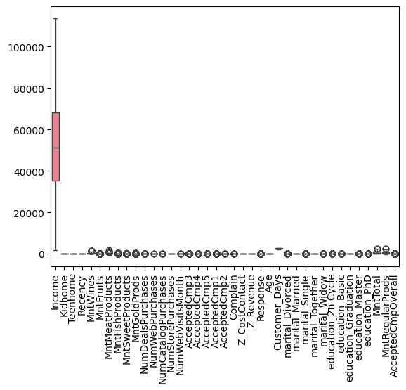
그런데, Income의 값이 너무 커서 다른 변수들이 잘 보이지 않습니다. 그래서 Income 변수와 나머지 변수들의 상자그림을 따로따로 그려주도록 하겠습니다.
But, the values of Income is so huge that other variables are not visible. Therefore I would draw a boxplot of Income and boxplots of other variables, respectively.
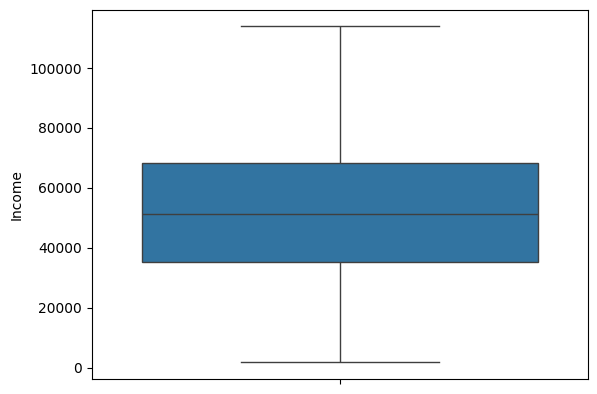
이 것이 Income의 상자그림입니다. 특잇값(아웃라이어)가 없는 것으로 보입니다.
This is a boxplot of Income. There are no outliers.
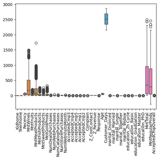
그러나 다른 값들은 아웃라이어가 있는 것으로 보이네요.
But other variables have outliers.
이제 EDA를 시작하도록 하겠습니다. 이번 시간의 EDA는 정말 간단한, 변수 하나하나의 특성만 보는 EDA 입니다.
Now I am going to start EDA. EDA of this time is only for characteristics of each variables.
1)
#1. EDA for Demographic Variables
#a) Income Variable - We can draw histogram

sns.histplot(food_df, x = "Income", bins = 50, kde = False)
plt.show()

#We can see it's bimodal, there are two modes. And it looks symmetric, the middle two points has the most of counts.
a.
우선 인류통계학적 변수들의 EDA입니다. 첫 번째 인류통계학적 변수는 Income인데요, 우리는 이를 통해 히스토그램을 그릴 수 있습니다.
FIrst, there are EDAs for demographic variables. The first demographic variable is Income, we can draw histogram by this variable.

우선, 이 히스토그램이 바이모달(최빈값이 두 개) 인 것을 알 수 있습니다. 그리고 값이 주로 $20,000에서 $80,000 사이 분포하네요. 더 좁게 보면 $30,000에서 $70,000 사이에 분포하는 듯 합니다. 그리고 거의 깔끔한 대칭 모양이네요!
First, we can see this histogram is bi-modal(there are two modes). And the value is between $20,000 and $80,000. For the narrower view, it is distributed between $30,000 and $70,000. And it is almost symmetrical!
#b) Age Variable - We can draw histogram

sns.histplot(food_df, x = "Age", bins = 50, kde = False)
plt.show()

#We can see it's multimodal, there are three modes. And the most frequent value is 40s generation.
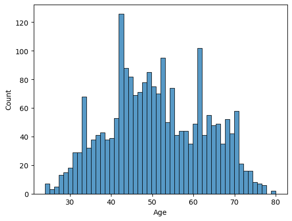
b.
두 번째 인류통계학적 변수는 Age입니다. Age 또한 연속형 변수이기 때문에 히스토그램을 그릴 수 있습니다. 히스토그램을 살펴보니, 유니모달(최빈값 하나) 임을 알 수 있습니다. 어설픈 대칭 모양이네요. 주로 40대가 많은 것으로 보입니다.
The second demographic variable is Age. Age is also a continuous variable so we can draw histogram. Looking at it, we can see uni-modal(there is one mode) weakly. It is symmetrical but not strongly. It looks there are many 40s people.
#c) If customer has kids - We can draw Bar charts

df_kids = food_df[["Kidhome", "Teenhome"]].melt(
    var_name = "Variable", value_name = "Value"
)

df_kids = df_kids[df_kids["Value"] != 0]

sns.countplot(x = "Variable", hue = "Value", data = df_kids)
plt.title("Kidhome & Teenhome distribution")
plt.show()

#We can see there are more teens than kids. But I wondered, what if one house has both kids and teens? So I made a new variable, "Offspringhome"
food_df["Offspringhome"] = food_df["Kidhome"] + food_df["Teenhome"]

#check its values
food_df[["Offspringhome", "Kidhome", "Teenhome"]].head()

#Let's make a bar chart with "Offspringhome"

sns.countplot(x = "Offspringhome", data = food_df)
plt.title("Number of Offsprings")
plt.show()

food_df["Offspringhome"].value_counts()
c.
자, 여기서 코드가 조금 길어졌는데요. 차근차근 살펴보도록 합시다. 이번에는 세 번째 인류통계학적 변수인 자식의 유무 입니다. Kidhome은 어린 아이들이 있는 집, Teenhome은 10대들이 있는 집을 뜻하죠. 우선, 두 그룹에 대한 바 모양 그래프를 그려보았습니다. 그런데 이게 맞나? 싶었어요. 왜냐하면 어린 아이가 있고, 또 10대도 있는 집도 있을 수 있잖아요? 그래서 어린 아이 vs. 십대를 보는 것도 좋지만 그냥 자식의 수를 나타내는 그래프를 그려보는 것도 나쁘지 않겠다는 생각이 들었습니다. 그래서 새로운 변수를 하나 만들고 (Offspringhome), 이에 대한 바 모양 그래프를 그려보았습니다.
Here, the code seems long and difficult- let's look at it. This time, the third demographic variable is if there are any offsprings at home. Kidhome means there are young children at home, and Teenhome means there are teenagers at home. At first, I drew bar chart of two groups. But I thought that if it is right. Because there might be people both have teenagers and young children. So it is good to see children vs. teenagers but also see the number of offsprings. Therefore I made a new variable (Offspringhome) and drew a bar chart of it.

이게 Kidhome vs. Teenhome 그래프고요, 집에 10대가 1명 있는 경우가 가장 많네요.
This is the graph of Kidhome vs. Teenhome, it is more likely to have one teenager at home.

이거는 자식의 수를 나타낸 그래프입니다. 여기서 정확한 숫자를 알고 싶으시다고요? 그렇다면 .value_counts() 함수를 사용하시면 됩니다.
그러면 0명이 628명, 1명이 1,112명, 2명이 415명, 3명이 50명이라는 수치가 보여집니다.
This graph shows the number of offspring. If you want precise number, then use the function called .value_counts().
Then, you can see the values. 0 offspring: 628, 1 offspring: 1,112, 2 offsprings: 415, 3 offsprings 50.
#d) marriage - We can draw Bar charts

df_marriage = food_df[["marital_Divorced", "marital_Married", "marital_Single", "marital_Together", "marital_Widow"]].melt(
    var_name = "Variable", value_name = "Value"
)

df_marriage = df_marriage[df_marriage["Value"] != 0]

sns.countplot(x = "Variable", hue = "Value", data = df_marriage)
plt.xticks(rotation = 90)
plt.title("marriage distribution")
plt.show()

df_marriage.value_counts()
d.
네 번째 인류통계학적 변수는 결혼의 여부입니다. 혼인 상태가 어떻게 되는지(혹시 이혼했는지...) 에 대한 변수인데요, 이 것 또한 바 모양 그래프로 수치를 나타내면 좋겠다고 생각했습니다.
The fourth demographic variable is marriage. It is about how the statement of marriage(perhaps they may be divorced...) they have, also I decided to draw bar chart of it.

똑같이, .value_count() 함수를 쓰면 구체적인 수치가 보여집니다. 일단 바 그래프 상으로는 결혼한 사람이 가장 많네요. 식료품점이라 그런가, 아무래도 주부들이 많이 찾겠죠?
As same, you can use .value_count() function to see precise number. We can see most people are married. Thus this is a grocery store (ifood), housewives frequently visits here.
marital_Married 854
marital_Together 568
marital_Single 477
marital_Divorced 230
marital_Widow 76
#e) Education - We can draw Bar charts

df_education = food_df[["education_2n Cycle", "education_Basic", "education_Graduation", "education_Master", "education_PhD"]].melt(
    var_name = "Variable", value_name = "Value"
)

df_education = df_education[df_education["Value"] != 0]

sns.countplot(x = "Variable", hue = "Value", data = df_education)
plt.xticks(rotation = 90)
plt.title("education distribution")
plt.show()

#We can see most of customers are graduated.

df_education.value_counts()
e.
다섯 번째 인류통계학적 변수는 학력 변수입니다. 사람들의 학력이 어떻게 되는지를 나타내는 지표인데요, 사실 저는 한국인이라 2n cycle이 뭔지, basic이 뭔지 알 지 못합니다. 찾아보니 1st cycle을 bachelor's degree, 2nd cycle을 master's degree라고 한다는데 근데 왜 master 변수도 있는건데... 그냥 분석을 위해 basic < graduation < 2n cycle < master <PhD라고 치겠습니다. 이번에도 바 모양 그래프를 그리고, .value_counts() 함수로 정확한 수치를 나타내어 주었습니다.
The fifth demographic variable is education. It shows people's education level, actually I'm Korean so I don't know about 2n cycle, and basic. I searched that 1st cycle is called bachelor's degree and 2n cycle is called master's degree... but why there is a master variable... Just for analysis I assume that basic < graduation < 2n cycle < master < PhD. This time I also drew a bar chart and showed precise numbers by .value_counts().
Variable Value
education_Graduation 1 1113
education_PhD 1 476
education_Master 1 364
education_2n Cycle 1 198
education_Basic 1 54
Name: count, dtype: int64
2.
#Period Variables EDA
#Relationship between Recency and Customer Days - Scatterplot

sns.scatterplot(data = food_df, x = "Recency", y = "Customer_Days")
plt.show()

#There is no relationship between recency and customer days. Then, we can draw histograms each.
#a) Recency

sns.histplot(food_df, x = "Recency", bins = 50, kde = True)
plt.show()
#Not showing any patterns.

#b) Customer Days

sns.histplot(food_df, x = "Customer_Days", bins = 50, kde = True)
plt.show()
#Not showing any patterns.

#Then, it is better to look at boxplots.
#a) Recency

sns.boxplot(food_df["Recency"])
plt.show()

#b) Customer Days

sns.boxplot(food_df["Customer_Days"])
plt.show()

#The distribution is uniform.

#Let's look at ECDF too.

sns.ecdfplot(food_df, x = "Recency")
plt.show()
가장 어려웠던 EDA 입니다. 기간 변수는 Recency와 Customer_Days로 이루어져 있는데, Recency는 얼마나 가까운 시일내에 구입한 적이 있는지, 그리고 Customer_Days는 고객이 된 지 며칠이 되었는지를 나타내는 변수입니다.
This was the most difficult EDA. Period variables are composed of Recency and Customer_Days. Recency means how recently they purchased, the day between now and the last purchase. Customer_Days means how many days they have been customers.

저는 이거 좀 아니라고 생각해요. 아니 산점도를 그리면 두 변수 사이에 관계가 있을 줄 알았는데, 없네요. 이렇게 뭐가 없는 그래프는 거의 처음 봅니다. 결론은, 둘 사이 관계가 없다는 거에요.
I think it's wrong. I thought that if I draw scatterplot, then I can see something but nope. I rarely see this kind of graph. For the conclusion, there is no relationship between two variables.
Recency 변수의 히스토그램입니다. 음, 분포가 균등하네요.
It's the histogram of Recency variable. Umm, the distribution is uniform.

Customer_Days 변수의 히스토그램입니다. 이 또한 분포가 정말 균등하네요.
It's the histogram of Customer_Days. This also has uniform distribution.
상자그림도 그려봤는데 그림이 참 예쁘네요. 평균과 중앙값이 거의 일치하고, 수염도 대칭 모양입니다. 정말 균등하게 분포되어 있네요.
I drew boxplots and they're beautiful. The value of mean and median almost equals, the whiskers are also symmetrical. They are really uniformly distributed.

경험적 누적분포 그래프를 그려봤습니다. x축은 Recency 값이고, y축은 누적 비율입니다. 그래프에서, 예를 들어 Recency가 60일 때 y값이 0.6이라면 고객의 약 60%가 최근 60일 내에 구매했다는 의미입니다. 이건 의미가 꽤 있네요.
I drew empirical cumulative distribution function. X-axis is Recency, and y-axis is proportion. In graph, for example if Recency is 60 and the value of y is 0.6, it means that 60% of customers purchased before 60 days. This is quite meaningful.
3.
#Purchase Dollars EDA
#First, let's see histograms of each kind of products.

sns.histplot(food_df["MntWines"], color="blue", kde=True, label="MntWines")
sns.histplot(food_df["MntFruits"], color="red", kde=True, label="MntFruits")
sns.histplot(food_df["MntMeatProducts"], color="green", kde=True, label="MntMeatProducts")
sns.histplot(food_df["MntFishProducts"], color="orange", kde=True, label="MntFishProducts")
sns.histplot(food_df["MntSweetProducts"], color="purple", kde=True, label="MntSweetProducts")

plt.legend()
plt.show()

#They are long-tailed, so we need log transform.
food_df["log_MntWines"] = np.log1p(food_df["MntWines"])
sns.histplot(data=food_df, x="log_MntWines", kde=True, bins=30)
plt.show()

food_df["log_MntFruits"] = np.log1p(food_df["MntFruits"])
sns.histplot(data=food_df, x="log_MntFruits", kde=True, bins=30)
plt.show()

food_df["log_MntMeatProducts"] = np.log1p(food_df["MntMeatProducts"])
sns.histplot(data=food_df, x="log_MntMeatProducts", kde=True, bins=30)
plt.show()

food_df["log_MntFishProducts"] = np.log1p(food_df["MntFishProducts"])
sns.histplot(data=food_df, x="log_MntWines", kde=True, bins=30)
plt.show()

food_df["log_MntSweetProducts"] = np.log1p(food_df["MntSweetProducts"])
sns.histplot(data=food_df, x="log_MntSweetProducts", kde=True, bins=30)
plt.show()

#Spending dollars on wines > Meat > Fish > Fruits > Sweets
이번에도 코드가 꽤 기네요. 그런데 다 의미가 있는 코드입니다. 이번 EDA는 구매 시 돈을 얼마나 썼는지, 이러한 변수에 대한 EDA인데요, 일단 각각의 히스토그램을 한 번 그려봤습니다. 와인에 쓴 돈, 과일에 쓴 돈, 고기에 쓴 돈, 생선에 쓴 돈, 군것질에 쓴 돈 이렇게 다섯 가지입니다.
Such a long code. But they are all meaningful. EDA for this time is about how much dollar the customers spent. First, I drew histograms of each variables respectively. Spent dollar for wine, spent dollar for furits, spent dollar for meat, spent dollar for fish, spent dollar for sweets -these 5 types.

이렇게 나타나는데요, 이렇게 보면 long-tailed의 모양을 가지고 있죠. 데이터가 Skewed 되어 있습니다. 그렇다면 무엇을 해 주어야 할까요? 바로 로그 변환입니다.
It looks like this, as you see it has long-tailed shape. Data is skewed. So what we have to do is log transformation.

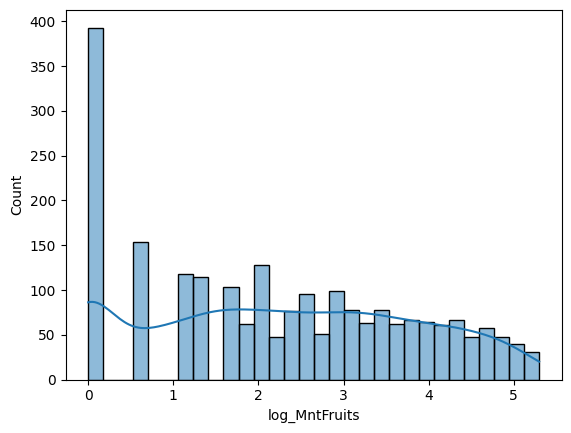


이렇게 모두 로그 변환을 해주었습니다. Skewed 된 정도가 조금은 줄어든 것 같죠? 그래도 아직 몇몇은 skewed 된 것 같지만, 이정도면 오케이입니다. 그리고 와인, 고기, 생선, 과일, 군것질 순으로 돈을 많이 썼군요.
This is the results of log transformation. The amount of skewed is quite reduced, don't it? Even few of graphs are skewed, but it's alright. And the customers spent most of their money on wine, and then meat, and then fish, and then fruits, and then sweets.
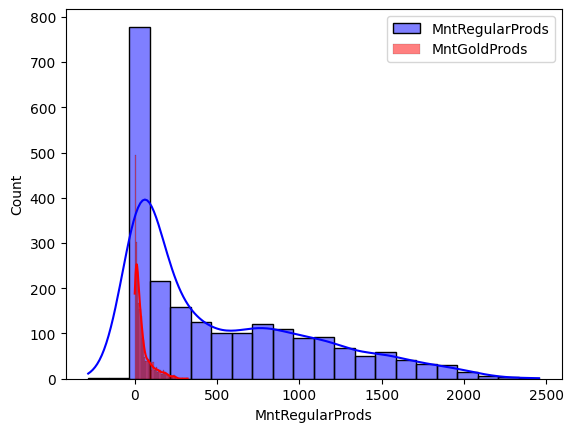
#Then, we compare normal products and gold products.

sns.histplot(food_df["MntRegularProds"], color="blue", kde=True, label="MntRegularProds")
sns.histplot(food_df["MntGoldProds"], color="red", kde=True, label="MntGoldProds")

plt.legend()
plt.show()

#Let's use log transformation.
food_df["log_MntRegularProds"] = np.log1p(food_df["MntRegularProds"])
sns.histplot(data=food_df, x="log_MntRegularProds", kde=True, bins=30)
plt.show()

food_df["log_MntGoldProds"] = np.log1p(food_df["MntGoldProds"])
sns.histplot(data=food_df, x="log_MntGoldProds", kde=True, bins=30)
plt.show()

#Spending dollars on Regular products > Gold products
그리고 프리미엄 상품에 쓴 돈과 일반 상품에 쓴 돈을 비교해 보겠습니다. 히스토그램을 겹쳐서 그려주고요, 이 또한 skewed 된 것 처럼 보이니 log transformation을 해 줍니다.
And let's compare spent dollars between gold products and regular products. I drew historgam put one upon another, and it seems like skewed again so we should do log transformation again.
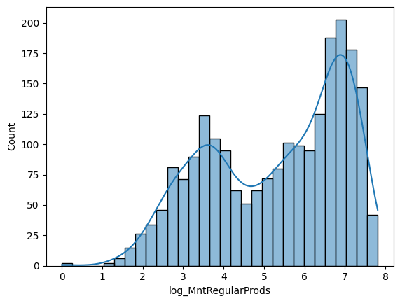
바이모달이구요, 꽤나 많이 돈을 썼네요.
It's Bi-modal, and they spent a lot.
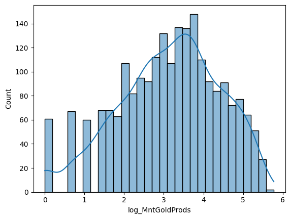
유니모달이구요, 그래도 일반 상품보다는 돈을 적게 썼네요.
It's Uni-modal, and they spent less than regular products.
#Let's see total $ spent - histogram

sns.histplot(food_df, x = "MntTotal", kde = True)
plt.show()

#Let's log-transform it too.

food_df["log_MntTotal"] = np.log1p(food_df["MntTotal"])
sns.histplot(data=food_df, x="log_MntTotal", kde=True, bins=30)
plt.show()
총합 값도 한번 보겠습니다. 역시 히스토그램 그려주고요, 이 또한 skewed 되어있기에 로그 변환 해줍니다.
Now we see total value. Also we can draw histogram, and it is also skewed so we should do log transformation.


높은 산이 두개가 있네요. 최빈값은 하나, 그렇지만 바이모달이 될 수도 있었을 것 같습니다.
There are two high mountains. There is one mode, but it could possibly be bi-modal.
4.
#Where did you find us EDA
#Bar chart

sums = food_df[["NumDealsPurchases", "NumWebPurchases", "NumCatalogPurchases", "NumStorePurchases"]].sum()
sns.barplot(x = sums.index, y = sums.values)
plt.xticks(rotation = 90)
plt.title("Where did you find us? (Sum of values)")
plt.show()

#In stores was the most.

sums
그리고 어떻게 이 스토어를 방문했는지에 대한 변수입니다. 여러 가지 루트가 있죠. 할인을 통한 루트, 웹사이트를 통한 루트, 카탈로그를 통한 루트, 스토어를 통한 루트 이렇게 4가지가 있습니다. 이들의 바 모양 그래프를 그려볼 겁니다. Count를 쓰지 않고 Sum을 쓰는 이유는, 열들의 합을 이용할 것이기 때문입니다.
And it's the variable about how the customers visited this store. There are many routes. There are four routes here: from deals, from websites, from catalogues, from stores. I would draw their bar charts. The reason why I use Sum instead of Count is that I would use the sum of rows.

스토어를 통한 방문이 제일 많네요. 할인으로 통한 방문이 가장 적은 것 같습니다.
Most people visited here by store. And the least by deals.
NumDealsPurchases 5112
NumWebPurchases 9042
NumCatalogPurchases 5833
NumStorePurchases 12841
dtype: int64
자세한 숫자는 이렇게 됩니다.
These are precise numbers.
food_df["NumWebVisitsMonth"].sum()
그리고 아까 햇갈렸는데, 이걸 방문 경로로 착각했지 뭐에요. 이건 월에 얼마나 웹사이트를 방문했는지 방문 횟수입니다.
I confused, I misunderstood this as visiting route. This is about how many times they visited website this month.
11768
값은 이렇게 나옵니다.
This is a precise number.
5.
#Accepted Campagin Variables EDA
#AcceptedCmp - Bar charts (counting)

df_cmp = food_df[["AcceptedCmp1", "AcceptedCmp2", "AcceptedCmp3", "AcceptedCmp4", "AcceptedCmp5"]].melt(
    var_name = "Variable", value_name = "Value"
)

df_cmp = df_cmp[df_cmp["Value"] != 0]

sns.countplot(x = "Variable", hue = "Value", data = df_cmp)
plt.xticks(rotation = 90)
plt.title("Campagin acceptance distribution")
plt.show()

#Most people accepted campagin at 4th opportunity, the least at 2nd opportunity.

df_cmp.value_counts()
그리고 어떤 캠페인을 accept 했는지에 대한 변수입니다. 캠페인이 1번째부터 5번째까지 있어요. 이를 선택한 사람들의 명 수를 세어 바 모양 그래프로 나타내어 보겠습니다.
And this variable is about what campaign they accepted. There are 5 campaigns. I would show bar chart by counting people who selected the campagin.

캠페인 3, 4, 5를 선택한 사람들의 수는 비슷하네요. 2를 선택한 사람의 수는 현저히 적습니다.
The amount of people who accepted campagin 3, 4, 5 are similar. But, people who selected campaign 2 are relatively small.
6.
#Complain EDA
#complain - bar chart

sns.countplot(x = "Complain", data = food_df)
plt.title("Number of Complains")
plt.show()

food_df["Complain"].value_counts()

#Only 20 complains.
컴플레인 수에 대한 변수를 살펴보겠습니다. 이를 바 모양 그래프로 나타내면 좋을 것 같아요. 그런데...
Let's look at a variable of number of complains. I think it would be good to represent it as a bar chart. But...
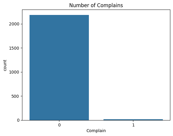
와, 컴플레인 수가 현저히 적네요. 스토어 관리를 잘 했나 봅니다.
Wow, there are so small amount of complaints. It seems like they managed store very well.
Complain
0 2185
1 20
Name: count, dtype: int64
정확한 숫자는 이렇게 됩니다. 20개의 컴플레인이 있었네요.
it's the precise number. There were 20 complaints.
7.
#Z-Variables EDA
#a) Z_CostContact (cost per customers) - histogram

sns.histplot(food_df, x = "Z_CostContact", bins = 10, kde = True)
plt.show()

#all of costs are 3

#b) Z_Revenue (revenue per customers) - histogram

sns.histplot(food_df, x = "Z_Revenue", bins = 10, kde = True)
plt.show()

#all of revenues are 11
이건 뭐 볼 필요가 사실 크게 있진 않습니다. 왜냐면 코드를 돌려 본 결과, 값이 각각 3, 11이 나왔거든요. 고객당 비용은 3, 고객 당 수익은 11로 생각하면 되겠습니다.
This is not important, I think. Because as I ran the code, the value was only two: 3 and 11. Cost per customers were 3 and revenue per customer was 11.
8.
#Response Variable EDA

sns.countplot(x = "Response", data = food_df)
plt.show()

food_df["Response"].value_counts()
고객 응답수에 대한 바 그래프를 그려보았습니다.
I drew a bar chart about responses.
Response
0 1872
1 333
Name: count, dtype: int64
정확한 숫자는 이러합니다.
And these are precise numbers.
EDA 결과를 바탕으로 한 대략적인 인사이트 (Insights based on the results of EDA)
1) 인류통계학적 변수 (Demographic Variables)
- 고객의 수입은 $30,000 - $70,000 사이인 경우가 많다. 아무래도 이 층이 중산층이고, 이 상점은 중산층을 타겟으로 한 것으로 보인다.(Their incomes are mostly between $30,000 and $70,000. They are mostly middle class, so it seems that this store targets middle class.)
- 연령은 40대가 가장 많다. 아마도 아이가 있고, 가족이 있는 경우 Grocery Store를 잘 이용할 것이기 때문이다. (Most of people are 40s. Maybe they have children and family, therefore they would use grocery stores very frequently.)
- 아이는 1명인 경우가 가장 많다. 대략적으로, 아이가 있는 경우가 없는 경우보다 많다. 이는 위의 이유와 같은 이유로 보인다. (Most of people have offsprings. As I mentioned before, it's because people who have family use grocery stores more frequently.)
- 결혼한 경우가 가장 많다. 이도 위와 같은 이유로 보인다. (Most of them are married, the reason why is what I mentioned above.)
2) 기간 변수 (Period Variables)
- 고객이 된 일수와 최근 구매한 날까지의 날짜는 균등하게 분포되어 있다. (Recency and customer days are uniformly distributed.)
- 최근 구매한 날까지의 날짜와 품목을 구매한 사람 수간의 비례관계가 존재한다. (As Recency increases, the number of people who purchased products also increase.)
3) 쓴 돈 변수 (Dollar Spent Variables)
- 분포가 skewed 되어있어 log transformation 해 주어야 한다. (The distribution is skewed, so we need log transformation.)
- 와인에 쓴 돈이 가장 많고, 그 다음이 고기, 생선, 과일, 군것질 순 이다. 아무래도 와인이 가장 비싸고, 그다음이 고기 아니면 생선, 군것질은 싸기 때문에 그러한 것으로 보인다. (Wine > Meat > Fish > Fruits > Sweets. It is because wine is the most expensive one, and then meat or fish, and sweets are not very expensive.)
- 누가 어떤 상품을 주로 구입하는지도 중요한 요소가 되겠다. (One important factor is who usually buys what kind of products.)
- 일반 상품 구입에 쓴 돈이 프리미엄 상품에 쓴 돈보다 더 크다. 그 이유는 프리미엄 상품을 꺼리는 고객들의 심리일까? 비싸다는 이유로, 꺼려할 수도 있겠다. (Regular Products > Gold Products. Is that because people are reluctant to buy premium products? Because of their price, the customers can be reluctant.)
- Income과 프리미엄 상품 구입 간의 연관성을 조사할 필요가 있다. (We need to analyze relationship between income and purchases of premium products.)
4) 어디에서 이 상점을 찾게 되었는지 (Visiting Route Variables)
- Store > Web > Catalogue > Deals
- 웹 사이트의 개발에 집중해 웹 기반 스토어 운영을 조금 더 신경써야 할 듯 하다. (They should concentrate on web-developing, so that they can manage web based store.)
- 카탈로그는 50-60대 인구가 많이 보기 때문에 조금 축소해도 좋을 듯 하다. (They can minimize the amount of catalogues - as the target of the catalogues is only for 50-60s)
- 할인 정보를 더 퍼뜨려야 한다. (They should spread more deals information.)
5) 캠페인 Acceptance (Campaign Acceptance Variables)
- 켐페인 2를 좀 더 개선해야 할 여지가 있어 보인다. (They should improve campaign two.)
- 전반적으로 캠페인에 참여한 사람 수가 많지는 않다. 고로, 캠페인을 더 매력적으로 만들어야 한다. 또는 타겟을 조정해야 한다. (Overall, there are not so many people who accepted campaigns. Therefore, they should make them more attractive. Or they should adjust targets.)
6) 컴플레인 (Complaint Variable)
- 컴플레인 양이 매우 적지만, 컴플레인을 무시할 수 없다. 그들이 어떤 사람들인지, 언제 마지막으로 구입했는 지 등에 대해서 분석하여야 한다. (The amount of complaints is very small, but we cannot ignore it. We should analyze who they are, when they lastly purchased and so on.)
7) Z-Variables
- 고객 당 변동비는 $3, 변동이익은 $11이다. (Cost per customer is $3, revenue per customer is $11.)
8) 응답 (Response Variable)
- 응답의 비율이 높지 않다. 어떤 사람들이 응답에 참여하지 않는지, 왜 응답에 참여하지 않는지 등에 대해서 조사하여야 한다. (There are not so many responses, therefore we should analyze who did not answered, why they did not respond.)